ShopDreamUp AI ArtDreamUp

Deviation Actions


Suggested Deviants


Suggested Collections


You Might Like…


Featured in Groups


Description
Details
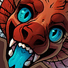
More song title names.So! Here is my [slightly late] submission to my newly revived art exchange -->

This month I got wispywaffle and I was able to draw her character, Wispy! I think I bit off way more than I could chew but it was a really nice challenge c': I tried my best to stay accurate to her design but I may or may not have accidentally changed some things. For that, I apologize. This is also the first time I've done a major background and the first time I've gotten to test my painty style with a full-body dragon. It took. A. Long. Time. Maybe that's just because I hand painted all the fur.
I struggled really really badly on those trees. But for all the effort I put into it, I'm relatively pleased with the outcome. Any critique on this is absolutely welcomed because I seek improvement.
Details
Materials.
110lb cardstock
005 Sakura Micron
gel pen
Original Dimensions.
unknown
Time Spent.
unknown
Copyright
Wispy ©
Art © Shinerai my face!
Image size
1500x975px 1.34 MB
© 2013 - 2024 Shinerai
Comments314
Join the community to add your comment. Already a deviant? Log In
Never used this feature on DA before, so here goes.
Since you said you were really interested in critiques, I thought I might mention a few things that jumped out at me.
I have a few suggestions for the landscape. Backgrounds are something I've neglected properly drawing for a long time, and have learned a few things in practicing recently that hopefully might be useful for you too. Something I've noticed is that, at least personally, landscapes have more impact if there are more noticeable variations in color, as it adds to the realism/believability. Even with high-saturated photos like these three, you can see that there are all kinds of color ranging from the dirt on the ground, to lush trees, deader leaves, and/or very pronounced shadow all throughout:
[link]
![[link]](https://www.deviantart.com/users/outgoing?http://3.bp.blogspot.com/-C6w20WLfYRM/T_KXwklOupI/AAAAAAAAB5o/q3G8S1UMqlw/s1600/_CED4681A.jpg)
[link]
![[link]](https://www.deviantart.com/users/outgoing?http://www.mavericksonlineden.com/forwards/pictures/BirdsEyeViewAerialPictures/BirdsEyeViewAerialPictures005.jpg)
[link]
![[link]](https://www.deviantart.com/users/outgoing?http://www.deichmann-photo.com/files/70-islands_aerial_palau_gunther-deichmann.jpg)
I see there's some color variation going on in your background, although it might help to exaggerate a little more. And aside from the corners of the landmass, there does not appear to be much indication of shadows either, just highlight. I think if maybe there were more shadows toward the center of the landscape, it might help make the trees look more individual and varied rather than a sort of single mass of uniform green.
The shading along the river banks also makes the landmass feel kind of like paper cut-outs to me, I think because the bank has such a hard edge with no indication of fading or shading to suggest a transition into the water. It kind of ends abruptly. I'm not sure how much of this is the water reflection though - since the reflections also have very hard lines rather than more of a blend into the water, coupled with the hard lines of the bank, it's tricking my eyes into thinking the reflections are actually shadows, and that the land is maybe even floating a little. It's probably because the water would have to be as still as glass to reflect its surroundings like a mirror, so perhaps distorting the reflections a bit to give the appearance of a current might alleviate some of that.
But! I don't know if you intended for it all to be that way, so I could be way off since I'm critiquing under the assumption that you're leaning more towards realism than stylized landscapes. x:
The last thing I keep noticing, but again could just be me, is that the left wing seems to dip a bit unusually low and it creates an odd asymmetrical shape for me. I'm not sure if this is what you were going for, but at least with birds, their wings are typically always positioned symmetrically for best flight. I think the overall result causes the character to almost look like it's falling more than flying, but since this is also obviously not a bird, I imagine the same rules don't have to apply, and often times taking artistic license to make a pose less realistic, but instead more dynamic, will balance things out nicely in the end anyway.
So hopefully maybe you might find some of this useful. But aside from those things, (which I believe are pretty minor anyway, despite typing so much - sorry about that, lol...), I believe this piece is still beautiful as usual. I really enjoy looking at your artwork because your colors, shading, lines, and great attention to detail are always so clean, smooth, and pleasing to view, and I think this piece is no different. I can imagine how tedious just painting all that fur must have been! Something I also really like is how you played with the angle of the landscape, making it sort of tilt with the character. I think it gives a very nice appearance of motion and makes me feel like I am also sweeping across the land. Awesome work overall!